Pantone Color Of 2015, Marsala In Interior Design
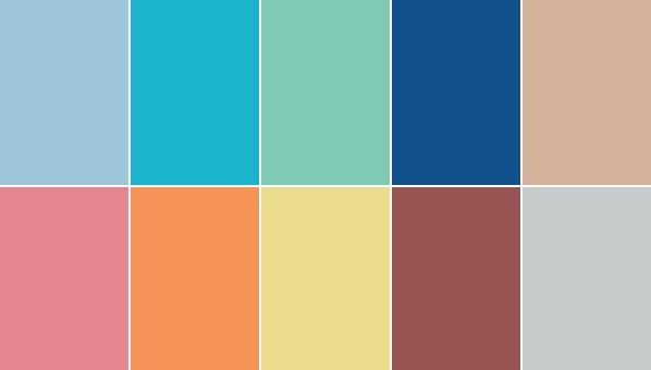
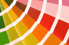
Pantone has announced the color of 2015. A wine red tint is going to rule over fashion and interior design this coming year. Named after wine made in Sicilly, Marsala is a beautiful muted color that is a bit similiar to the ever trendy oxblood only lighter, washed out and with more brown to it. Besides Marsala Pantone has included a few other great tints into its 2015 report, in case you don’t like their main choice.
Marsala In Interior Design
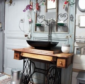
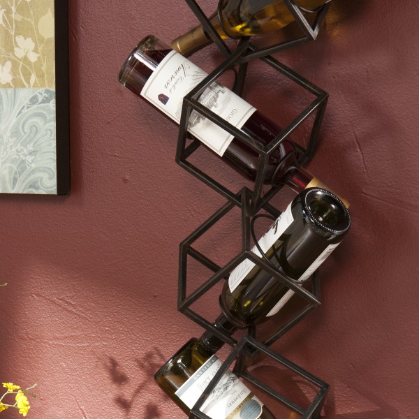
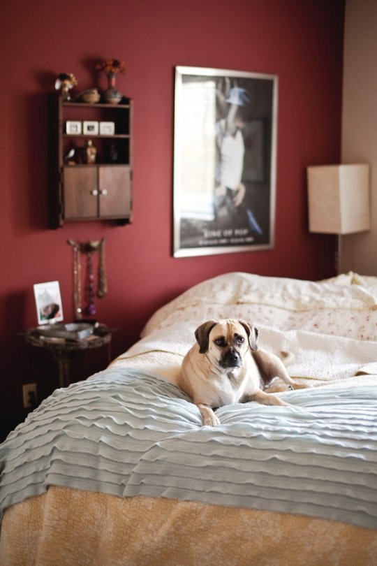
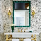
While Marsala is a great accent color it can be used much more generously in classic interiors. Since the color is on the darker side be prepared to use other space-enhancing tricks than color or choose a room that is big enough or which you don’t need to be too light or big.
Wine red goes well with quite a few colors too. From grey to gold to aquamarine that is also in Pantone’s 2015 color report.
Pantone’s Color Report of the Year 2015
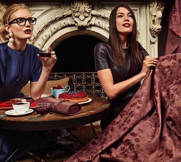
If you want something more modern go with the accents like bed throws, pillows, or small furniture pieces. In a neutral interior these accents will especially stand out all the while enriching the look of the room. If you find that you like the color and would like to add more go with a carpet, couch, or curtains and see if you’re ready to commit. It’s always easier to replace smaller accents than the wall color.
We’ve also noticed that Pantone favors the color green >particularly its turquoise shades. In 2013 it was Emerald, turquoise in 2010, blue turquoise in 2005, and aqua sky in 2003. This year the color is still in the top ten. So if you are not a fan of an earthy dark red turquoise may be a way to go.
Mona Liz
Latest posts by Mona Liz (see all)
- Niches in Modern and Ancient Styles - June 15, 2016
- The SleepClean Pillowcase Kills Bacteria With Silver Threads - June 13, 2016
- Kitchen Greenery Decor Ideas - June 10, 2016
Leave a Reply

 Color
Color Design Style
 Small Space
 Useful Tips