Color Strategies That Make Small Rooms Feel Larger
The instinct when decorating a small room is to reach for white paint and call it done. While light colors do expand space visually, an all-white room often feels more clinical than spacious. The truth about color in compact spaces is more nuanced — and far more interesting — than simply going pale.
The Case for Light and Bright
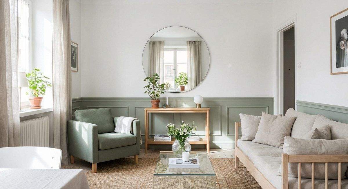
Light colors reflect more light than dark ones, and reflected light is what creates the perception of openness. But “light” does not mean “white.” Soft sage, pale blush, light warm gray, and cream all reflect ample light while adding warmth and personality that pure white cannot. The key is maintaining a high light reflectance value — generally above 60 on a scale of 100 — while introducing subtle color.
Painting ceiling and walls the same color eliminates the visual boundary between them, making the room feel taller. Extending the same color onto trim and moldings creates a continuous envelope that reduces visual clutter and maximizes the sense of volume.
The Surprising Power of Dark Colors
Counterintuitively, deep colors can make small rooms feel larger. A rich navy, deep emerald, or charcoal gray on every surface — walls, ceiling, trim — blurs the room’s boundaries. The eye cannot easily locate where walls end and corners begin, and the resulting ambiguity reads as depth rather than confinement.
This approach works best in rooms with limited or artificial lighting: powder rooms, hallways, bedrooms used primarily at night. The dark palette creates an intimate, enveloping atmosphere — a jewel box rather than a cramped closet. Glossy paint finishes enhance the effect by reflecting points of light across the darkened surfaces.
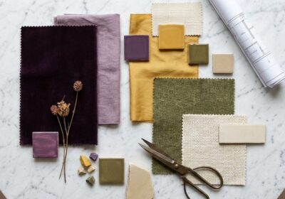
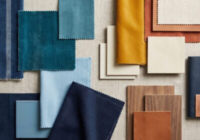
Monochromatic Depth
Using a single hue across multiple values — pale on the ceiling, medium on the walls, deep on the floor — creates a gradient that the eye reads as spatial progression. This tonal approach adds visual interest without the fragmentation that multiple colors introduce in tight quarters.
Textural variation within the monochromatic scheme adds further richness. A linen sofa, velvet cushions, a woven rug, and matte walls — all in the same warm gray family — create a layered, sophisticated space that feels curated rather than constrained.
Strategic Accent Placement
A single accent color, used sparingly, can direct the eye and create focal points that distract from spatial limitations. A bright coral cushion against a neutral sofa, a mustard pendant light in a gray kitchen, or a turquoise door in a white hallway — these calculated punctuations give the eye a destination, and a room with clear focal points always feels more intentional than one that simply feels small.
The accent should appear in at least two locations to feel deliberate: a cushion and a piece of art, a lamp and a vase. Isolated single accents look accidental; repeated ones look designed.
Horizontal and Vertical Emphasis
Color can manipulate perceived proportions. Painting the lower third of a wall in a deeper shade and the upper two-thirds in a lighter tone — a contemporary take on the dado rail — emphasizes horizontal lines and makes rooms feel wider. Conversely, vertical stripes or a color that extends from wall to ceiling draws the eye upward and adds perceived height.
In narrow rooms, painting the end wall a warm, advancing color (terracotta, ochre, blush) visually pulls it forward, reducing the tunnel effect. The side walls in a cooler, receding tone (blue-gray, sage, lavender) appear to push outward. The room feels more proportionate without any structural change.
Continuity Across Spaces
In small homes, using a consistent palette throughout all rooms creates flow that makes the entire home feel larger than the sum of its parts. Varying the intensity of the same base color — deeper in private rooms, lighter in shared spaces — maintains visual continuity while allowing each room its own identity.
Sources & Further Reading
You May Also Like