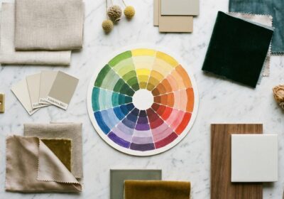
The Complete Guide to Choosing Ceiling Paint Colors
The ceiling — often called the fifth wall — is the largest uninterrupted surface in most rooms, yet it receives the least design attention. The reflexive choice of flat white is so universal that many homeowners never consider alternatives. That default leaves a significant design opportunity untouched.
Why White Is Not Always Right
White ceilings work in rooms with standard height, good natural light, and a need for maximum visual openness. But in tall rooms, white ceilings feel disconnected from the walls below, creating a cavernous, impersonal atmosphere. In small rooms with warm wall colors, a stark white ceiling creates a jarring contrast that draws the eye upward and emphasizes the room’s limitations. And in rooms with little natural light, white ceilings appear gray — a dull, lifeless gray that no one intended.
Matching Walls and Ceiling
Painting the ceiling the same color as the walls — or a slightly lighter tint of the same hue — eliminates the visual break between vertical and horizontal surfaces. The room reads as a continuous volume rather than a box with a lid. This approach works especially well in rooms with low ceilings, where the color continuity prevents the ceiling from pressing down on the space.
For rooms painted in deeper tones, mixing the wall color with an equal part of white produces a ceiling shade that complements without matching exactly. This preserves the sense of upward expansion while maintaining the enveloping quality of the wall color.
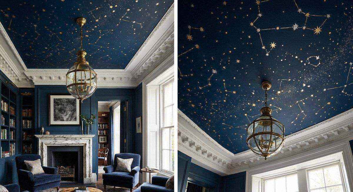
Bold Ceiling Colors
A deeply colored ceiling — navy, charcoal, deep emerald — creates drama and intimacy. In rooms with high ceilings, dark colors bring the ceiling visually closer, creating a cozier proportion. In dining rooms and bedrooms, where intimacy is desirable, a dark ceiling adds sophistication that feels deliberate and curated.
The contrast between dark ceiling and lighter walls reverses the conventional hierarchy, directing attention upward and making the ceiling a feature rather than a background. Light fixtures, crown molding, and ceiling medallions become more prominent against a dark ground.
Warm vs. Cool Tones
Warm ceiling colors — soft peach, cream, pale gold — create the impression of ambient warmth, as if the room were lit by late-afternoon sun. These work beautifully in north-facing rooms that lack direct sunlight and tend toward cool, blue-gray tones.
Cool ceiling tones — pale blue, soft gray, icy lavender — suggest sky and openness. The color blue, in particular, has been shown to create a perception of increased ceiling height. Benjamin Moore’s “Breath of Fresh Air” and Farrow & Ball’s “Borrowed Light” are popular choices that add just enough blue to lift the ceiling without imposing a strong color statement.
Sheen and Finish
Flat or matte finishes hide surface imperfections — cracks, patches, uneven textures — that overhead lighting accentuates. This practical advantage is why flat white became the default. However, a high-gloss finish on a ceiling creates a lacquered, reflective surface that mirrors the room below, adding perceived height and a sense of luxury associated with historic formal rooms.
High-gloss colored ceilings require perfectly smooth surfaces and professional application, but the result — a mirror-like plane of deep color overhead — is among the most striking finishes available in residential interior design.
Practical Guidelines
Test ceiling colors the same way you test wall colors: apply a large sample and observe it at different times of day. Ceiling samples should be viewed from across the room, not up close. Light reaching the ceiling is always indirect and varies throughout the day, so a color that looks perfect at noon may read entirely differently under evening artificial light.
When in doubt, err on the side of subtlety. A ceiling two shades warmer than white — barely perceptible when viewed in isolation — can transform the quality of light in the room without committing to a bold design statement.