The Essential Guide to Colors That Go With Orange
Orange divides opinion more sharply than any other color in interior design. Its advocates prize its energy, warmth, and optimism; its detractors associate it with outdated 1970s decor and visual aggression. The truth, as with most color debates, lies in the shade and the company it keeps. The right orange in the right combination creates interiors of remarkable warmth and sophistication.
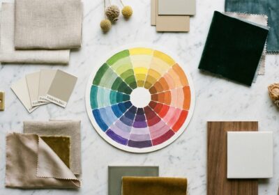
The Orange Spectrum
Burnt orange and terracotta are muted, earthy tones that read as sophisticated neutrals in warm-toned palettes. Rust and amber carry similar warmth with added depth. Coral bridges orange and pink, softening the color’s intensity. Tangerine and bright orange are the high-energy variants — bold, cheerful, and best used as accents. Peach and apricot sit at the softest end, offering warmth without assertion.
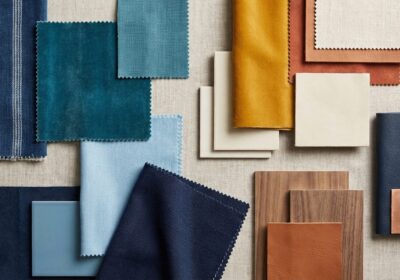
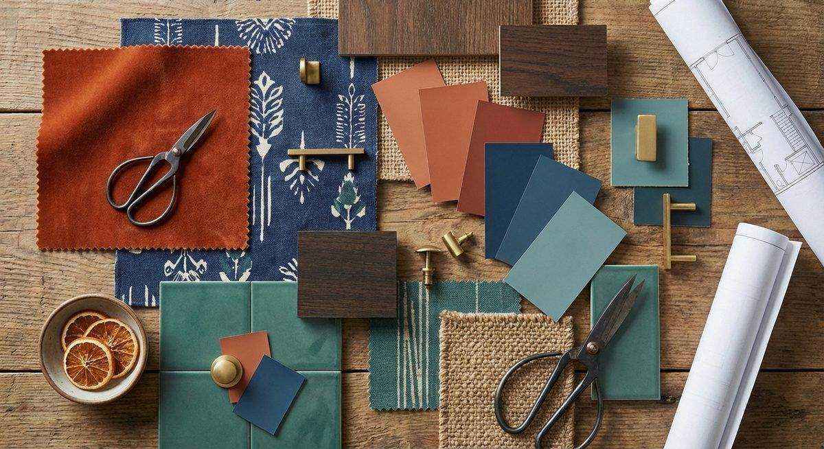
Orange and Navy
This is perhaps the most universally successful orange combination. The deep cool blue grounds orange’s warmth, creating a balanced, vibrant palette that works in virtually any room. A navy sofa with burnt orange cushions, a terracotta wall with navy curtains, rust-toned accessories in a navy-painted study — the pairing is energetic yet sophisticated.
Orange and Teal
Teal — blue-green — provides complementary contrast that vibrates with energy. The combination is bold and contemporary, well-suited to accent applications: a teal wall with orange artwork, or terracotta ceramics on a teal-painted shelf. The intensity of the pairing benefits from neutral mediation — white, cream, or gray surfaces between the two colors prevent visual overload.
Orange and Gray
Gray neutralizes orange’s intensity while orange warms gray’s coolness — a mutually beneficial relationship. Charcoal gray with burnt orange creates a refined, masculine palette. Light gray with peach or apricot produces a soft, contemporary combination. The proportion should favor gray, with orange appearing as a purposeful accent rather than an equal partner.
Orange and White
Crisp white makes orange pop with maximum contrast. The combination feels fresh, modern, and summery — well-suited to kitchens, dining rooms, and contemporary living spaces. White walls provide a gallery-like backdrop for orange furniture, art, or textiles, allowing the warm color to command attention without competition.
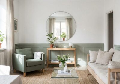
Orange and Green
Terracotta and sage green reference the natural landscape — clay earth and growing things — creating an organic palette with inherent harmony. Burnt orange and olive green produce a warm, autumnal combination. Brighter oranges with vibrant greens create a tropical energy that suits playful or bohemian spaces. Plants in terracotta pots are the simplest expression of this natural partnership.
Orange and Wood Tones
Orange belongs to the same warm family as natural wood, making timber an ideal companion material. Walnut, oak, and teak all harmonize with orange tones, creating spaces that feel grounded and organic. The combination works particularly well in Scandinavian and mid-century modern contexts, where warm wood and earthy tones form the palette’s foundation.
Dosing Orange
Start small. A pair of terracotta cushions, a rust-colored throw, an orange vase — these introductions test the color’s effect before larger commitments. Once comfortable, expand to a statement piece: a burnt orange armchair, a terracotta accent wall, an orange-toned rug. Full-room orange — walls, ceiling, and major surfaces — is an expert move that requires exceptional confidence and perfect companion colors.