The Complete Guide to Colors That Go With Purple
Purple occupies a unique position on the color wheel — bridging the warmth of red and the coolness of blue, it carries associations with creativity, luxury, and tranquility depending on its specific shade. The colors chosen to accompany purple determine which of these qualities emerges most strongly in the finished room.
Understanding Purple’s Range
Lavender, lilac, and wisteria are soft, cool purples with blue undertones — calming and feminine. Mauve and dusty plum carry warm, grayed undertones — sophisticated and vintage. Amethyst and violet sit at the blue-purple boundary — rich and jewel-like. Eggplant, aubergine, and deep plum are dark, warm purples — dramatic and enveloping. Each shade behaves differently in combination.
Purple and Gray
Gray is purple’s most versatile partner. Cool gray paired with lavender creates a serene, contemporary palette suited to bedrooms and bathrooms. Warm gray with plum produces a sophisticated, moody combination for living rooms and dining spaces. The neutrality of gray allows purple to express its character without competition.
Purple and Green
As complementary colors (opposite on the color wheel), purple and green create vibrant, balanced combinations. Sage green with lavender produces a garden-inspired palette that feels fresh and natural. Emerald with deep plum creates a rich, jewel-toned pairing with dramatic impact. The natural world validates this combination constantly — wisteria on green vines, purple coneflowers in green meadows.
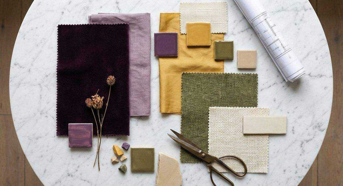
Purple and Yellow/Gold
Gold accents against purple create luxury associations that date to royal courts. Brass hardware, gold-framed mirrors, and amber-toned accessories elevate purple from pretty to prestigious. Mustard yellow paired with deep purple produces a bold, confident combination with retro appeal. Softer combinations — butter yellow with lilac — create springlike freshness.
Purple and White
White provides maximum contrast and visual cleanliness. Crisp white walls with purple upholstery or accessories create a fresh, contemporary look. Cream rather than bright white softens the contrast and adds warmth. Too much white with too little purple creates a clinical feeling; maintain enough purple presence to establish it as a genuine color choice rather than an afterthought.
Purple and Pink
Adjacent on the warm side of the color wheel, purple and pink create combinations that range from playful (magenta with violet) to sophisticated (dusty rose with mauve). The key is choosing shades at similar saturation levels — vivid with vivid or muted with muted. Mixing intensities creates discord.
Purple and Navy
Two deep cool tones together might seem overwhelming, but navy and plum create a richly layered, tone-on-tone combination that works beautifully in bedrooms and libraries. The shared blue undertone creates harmony while the distinction between blue and purple prevents monotony. Lighten with cream or brass accents to prevent the palette from becoming too heavy.
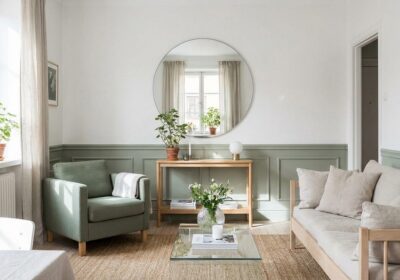
Using Purple in Practice
For those hesitant about purple, begin with accessories: cushions, throws, a vase, artwork. These elements test the color’s impact without permanent commitment. For bolder applications, an accent wall in deep plum or a velvet sofa in amethyst makes a confident statement that the surrounding palette can support with any of the partnerships described above.