Using the Color Wheel in Interior Design: A Guide
Color is the single most powerful tool in an interior designer’s arsenal — more impactful than furniture selection, more immediate than spatial arrangement, and more emotionally resonant than any decorative accent. Yet for many homeowners, choosing a color palette remains the most intimidating step in any decorating project. The color wheel offers a systematic way to move from uncertainty to confidence.
Understanding the Color Wheel
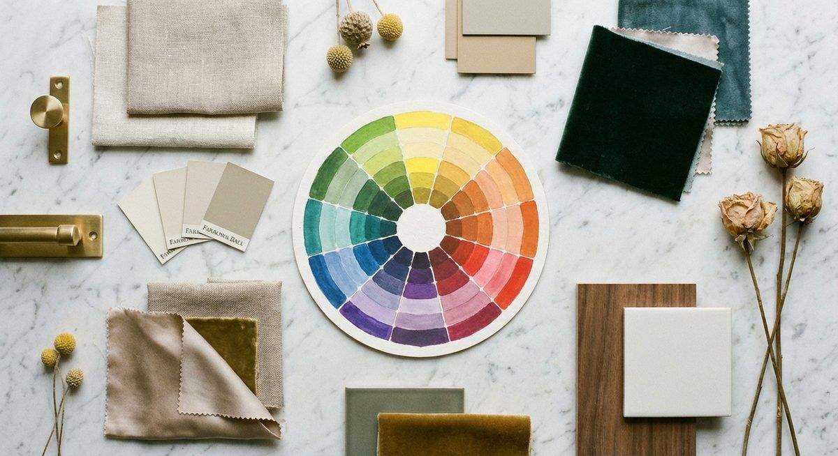
The standard color wheel arranges twelve hues in a circle based on their relationships. Three primary colors — red, yellow, and blue — form the foundation. Mixing adjacent primaries produces three secondary colors: orange, green, and violet. A further round of mixing yields six tertiary colors, completing the twelve-spoke wheel.
This arrangement is not merely academic. The spatial relationships between colors on the wheel predict how they will interact visually when placed together in a room. Colors opposite each other create energy; colors adjacent to each other create harmony; colors spaced equally around the wheel create balance.
Value and Saturation
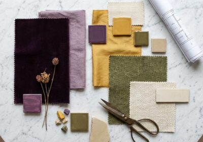
Hue — the named color — is only one dimension. Value describes how light or dark a color appears, from the palest tint to the deepest shade. Saturation measures intensity, from muted and grayed to vivid and pure. A sophisticated palette manipulates all three dimensions: perhaps a deeply saturated navy paired with a pale, desaturated sage and accents of warm brass.
In practice, rooms decorated exclusively with high-saturation colors feel overwhelming, while rooms confined to low saturation feel flat. The interplay between the two — a predominantly muted palette punctuated by one or two vivid accents — produces the sense of visual richness that distinguishes professional interiors from amateur ones.
Classic Color Schemes
Complementary
Colors directly opposite on the wheel — blue and orange, red and green, yellow and violet — produce maximum contrast. In interiors, complementary schemes work best when one color dominates and the other appears as an accent. A navy living room with burnt orange cushions and copper accessories demonstrates the principle without visual conflict.
Analogous
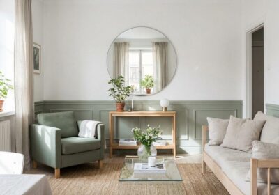
Three to five adjacent colors on the wheel create a harmonious, low-contrast palette. A bedroom in sage green, soft teal, and dusty blue feels cohesive and restful. The risk with analogous schemes is monotony — counteract it by varying values and introducing neutral anchors like white, charcoal, or natural wood.
Triadic
Three colors equally spaced around the wheel — such as red, yellow, and blue — create vibrant, balanced compositions. Triadic schemes suit playful spaces like children’s rooms or creative studios. Muting the saturation of all three colors transforms the combination from primary-school bold to sophisticated and layered.
Split-Complementary
A base color paired with the two colors adjacent to its complement. This scheme offers the visual interest of complementary pairing with less tension. Teal paired with coral and warm gold illustrates the approach: energetic but approachable.
The 60-30-10 Rule
Professional designers frequently distribute color using the 60-30-10 proportion: 60 percent dominant color (walls, large furniture), 30 percent secondary color (upholstery, curtains, rugs), and 10 percent accent color (artwork, throw pillows, decorative objects). This ratio produces visual balance regardless of which specific colors are chosen.
The dominant 60 percent is typically the most neutral or muted of the three, the secondary 30 percent introduces depth and contrast, and the accent 10 percent delivers the personality. Changing only the accent color — swapping amber cushions for emerald, for instance — can dramatically shift a room’s character without repainting or reupholstering.
Working With Neutrals
Neutrals — whites, grays, beiges, and blacks — sit outside the color wheel but function as essential mediators. They provide visual rest between colors, prevent palettes from becoming overstimulating, and ground vivid hues with stability. A warm neutral like greige (gray-beige) harmonizes with earth tones; a cool neutral like blue-gray complements jewel tones and coastal palettes.
The most common mistake in neutral-heavy interiors is neglecting undertones. Every white has a lean — warm (yellow, pink) or cool (blue, green) — and selecting whites with inconsistent undertones produces a subtle but persistent sense of visual discord. Test paint samples under both natural and artificial light before committing.
Putting It Into Practice
Start with a single inspiration piece — a favorite artwork, a patterned textile, a cherished object — and extract three to five colors from it. Locate these colors on the wheel to understand their relationship, then assign them to the 60-30-10 framework. Gather physical samples (paint chips, fabric swatches, material finishes) and evaluate them together in the actual room, under its specific lighting conditions. Color behaves differently in every space, and the wheel provides a map — but the room has the final word.
Sources & Further Reading
- Pantone — Color Theory Resources
- Sherwin-Williams — Color Basics
- Better Homes & Gardens — Color Wheel Guide