The Art of Arranging Interior Accessories Like a Stylist
The difference between a well-furnished room and a well-styled room lies in the accessories — the objects that occupy surfaces, shelves, and walls after the furniture is placed. Professional stylists work with a set of principles that transform random object placement into intentional composition. These principles are learnable and applicable in any space.
The Rule of Odds
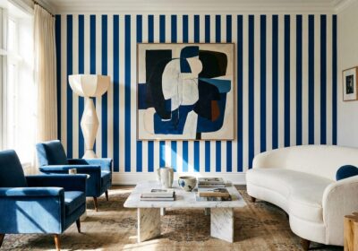
Objects arranged in odd numbers — three, five, seven — create more dynamic compositions than even groupings. The eye moves restlessly between even-numbered objects, seeking a center that does not exist; odd-numbered groupings provide a natural focal point flanked by supporting elements. Three candlesticks of varying heights. Five books stacked with a small object on top. Seven framed photographs in a gallery arrangement. The odd number creates visual tension that reads as intentional rather than symmetrical.
Varying Height
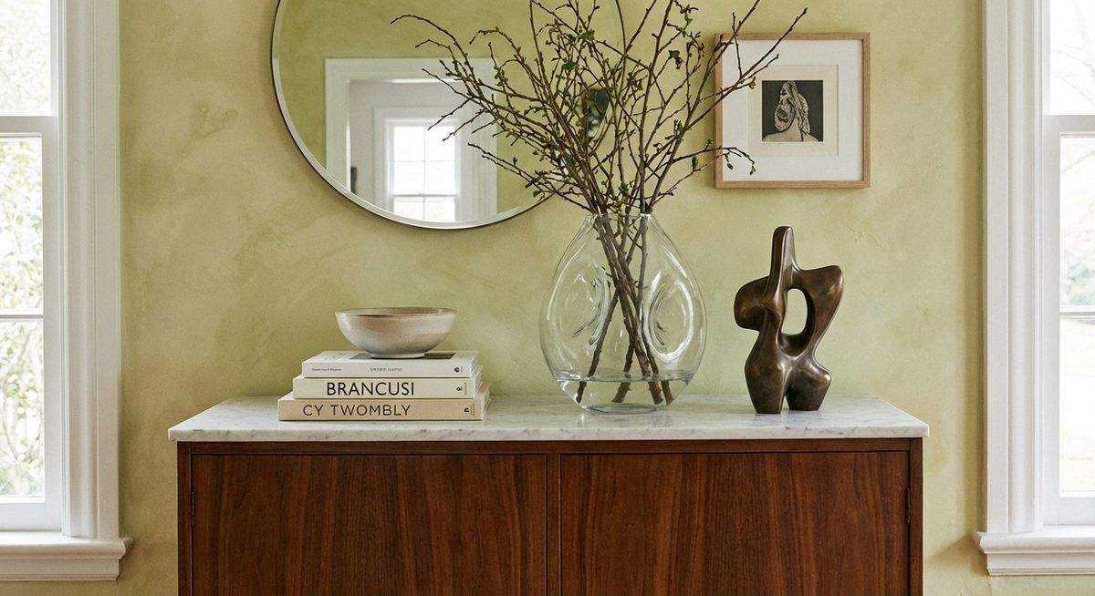
A flat arrangement of objects at the same height produces a visual line that the eye scans and dismisses. Varying the heights — tall vase, medium sculpture, short stack of books — creates a silhouette that the eye follows with interest. The triangle principle guides this: arrange objects so their tops form an imaginary triangle, with the tallest at one end and the composition stepping down to the shortest.
The Vignette
A vignette is a small, self-contained arrangement that tells a visual story on a single surface. A console table vignette might include a lamp (height and light), a framed photo (personal element), a small plant (organic life), and a decorative box (functional storage). Each element plays a role; removing any one would diminish the composition.
Effective vignettes layer objects in front of one another, creating depth on a two-dimensional surface. The lamp at the back, the frame slightly forward, the plant overlapping the frame’s edge, the box in front — this depth reads as considered rather than crowded.
Negative Space
The space between and around objects is as important as the objects themselves. A shelf packed edge to edge with accessories feels cluttered regardless of the quality of each piece. Leaving 30 to 40 percent of a shelf surface empty allows each object room to breathe and be appreciated individually. Negative space communicates confidence — the willingness to let a few good pieces speak rather than filling every gap with additional stuff.
Color Threading
Repeating a color across multiple accessories on different surfaces creates visual continuity throughout a room. A blue ceramic on the bookshelf echoes a blue cushion on the sofa and a blue binding in a stack of books on the coffee table. This threading — subtle, not matchy — ties a room together the way a musical motif ties together a composition.
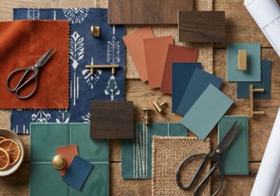
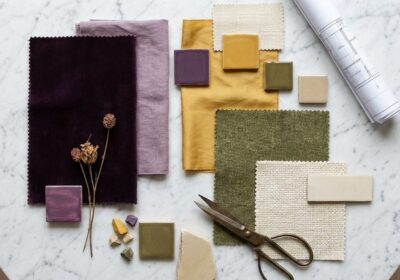
Texture Mixing
A grouping of objects in varied materials — a glass vase, a wooden bowl, a woven basket, a metal sculpture — engages the sense of touch visually. The contrast between smooth and rough, matte and glossy, organic and manufactured creates the layered richness that distinguishes styled spaces from furnished ones.
The Edit
Professional stylists consistently remove objects from rooms rather than adding them. If a surface looks cluttered, the solution is almost never a different arrangement — it is fewer pieces. Edit relentlessly. Keep the best, store the rest, and resist the urge to display everything simultaneously. A room of well-chosen, well-spaced objects will always feel more designed than a room of many objects competing for attention.