Decorating 101: Color Wheel, Value And Balance
Color plays in important role in decorating. It can really express your sense of style, create an atmosphere, and make the design pop. There are some basic things you need to know about color to create a good decor. If you want to learn more about the color or hues learn how to read the color wheel. It is a tool that shows how the hues generate from each other. Red, yellow, and blue are considered to be the primary colors, which can be mixed in order to produce other colors and hues. Such colors as purple and green come from the mixture of red and blue and yellow and blue accordingly.
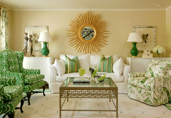
The colors and hues can be complementary or analogous. Complementary colors are shown opposite to each other on the color wheel and analogous hues are located near each other and are generated from the same hue.
Triads are the three colors located equally on the color wheel and work greatly together if balanced right. The formula where one color is dominant and the other two are supplementary works well.
The colors can also be described as warm and cool. The color wheel is divided in half from red to green – warm colors, the rest are cool colors. Warm colors are lively and vivid, advancing. Cool colors are receding and are great for visually enhancing the small places.
If you chose a cool color scheme for your design it doesn’t mean you should stick only with cool colors. A small pop of cool color in the warm color scheme or otherwise will complete and perk your design.
Some colors have both advancing and receding effects such green and purple, so they can sometimes play a part of neutrals in the design.
Colors have value. The colors can light or dark. Lighter values of colors are called tints, which are extensively used in decorating, and darker values are called shades or tones. Those tints and tones are not usually called just green or red, but rather bear more enhanced names as grass green, for example.
Balance of colors is good. Light values can be balanced with neutrals or medium values, however such color schemes can become plain and boring pretty quick. Here come the accents. Accents help bring in a stylish touch to the whole design. For instance, a color scheme of light pink and cream white the pop of hot pink or red will brighten up the view.
The intensity of the color will identify the mood of the room. If it’s bright and highly intense, it will bring more energy to the room and atmosphere, muted colors, on the other hand, create a calm atmosphere. While you might want to choose high or low intensity color schemes while decorating certain rooms, balance is always a good and safe thing.
Choose one dominant high-intensity color in your color scheme and pair it with a muted, low-intensity color. Play with color combination, look at the samples and carry them home to choose the best working and balanced scheme for your design.
Mona Liz
Latest posts by Mona Liz (see all)
- Niches in Modern and Ancient Styles - June 15, 2016
- The SleepClean Pillowcase Kills Bacteria With Silver Threads - June 13, 2016
- Kitchen Greenery Decor Ideas - June 10, 2016
Leave a Reply







 Color
Color Design Style
 Small Space
 Useful Tips

December 11th, 2010 at 2:11 am
Very Nice website. I recently built mine and i was looking for some design ideas and you gave me a few. Did you develop the website alone?
Thank you
January 13th, 2011 at 7:33 am
Wow this is a great resource.. I’m enjoying it.. good article
January 14th, 2011 at 4:02 am
I impressed reading your article. Keep the good job but Ill be in touch. Lookin’ forward
January 20th, 2011 at 9:40 pm
Keep up the good job 🙂 Best wishes from Ontario, Canada
January 29th, 2011 at 6:20 am
Clear and concise . Eager for more like this.
January 29th, 2011 at 6:40 am
I appreciate the factual written content and your time and energy you put into it. Eager for reading more from you.
March 14th, 2011 at 11:56 am
i like this ponits! thanks for this Tips!
April 10th, 2013 at 4:09 am
Dear admin, thnx for sharing this blog post. I found it wonderful. Greatest regards, Victoria…
October 3rd, 2013 at 7:57 pm
Hi there! I just wanted to ask if you ever have any problems
with hackers? My last blog (wordpress) was hacked and I ended up losing a
few months of hard work due to no data backup.
Do you have any solutions to prevent hackers?
July 8th, 2014 at 10:54 pm
Hello, Neat post. There is a problem together with your website in internet explorer, would check
this? IE nonetheless is the market leader and a good component
to people will leave out your wonderful writing due to this problem.
August 16th, 2014 at 10:08 pm
I see you share interesting content here, you can earn some extra cash, your
blog has huge potential, for the monetizing method, just type in google – K2
advices how to monetize a website
September 26th, 2014 at 8:08 am
great advice on the use of a color wheel, thanks